Thursday, July 19, 2012
New Blog.
Hey everyone! I'd like to invite you all to follow my new tumblr, davidsaracino.tumblr.com ! I won't be posting on here anymore, so if you want to keep up to date on my work, czech it out.
Sunday, June 17, 2012
Beekeepin'
This week's Advice column illustration for WashPost CapBiz. The story was about crowdsourcing; or gathering a great deal of information from a large group of consumers. It almost immediately made me think of harvesting honey. It also allowed me to get creative with composition and color choices.
 ...and as always, the layout:

 ...and as always, the layout:

Thursday, June 7, 2012
Testing....testing
Sunday, May 27, 2012
Bike Fixin'
I'm preparing another mass-mailer blast, and came up with this little diddy to send to cycling magazines and some kids publications, like Highlights and Boys Life.
Monday, May 21, 2012
Attention Whore
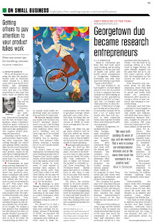
This week's advice column for WashPost CapBiz. The article was tailored to businesses trying to launch a new product, and detailed ways to get it noticed the right way, and the wrong way.
...and as always, here's the print layout.
Monday, May 14, 2012
Here's this week's advice column illustration. It advised businesses to use social media to test for consumer approval, and to be able to spy on rival businesses to see what their customers like / dislike about their practices. Ps I hand drew that Facebook News Feed....I'm losing my mind.
And here's the layout:
Tuesday, May 8, 2012
Here's this past week's Washington Post Capital Business advice column. It featured an article by Barbara Degray about the pro's and con's of hiring workers remotely / working remotely. I'm really digging the opportunities to experiment with pushing my style and color choices.
and here's the layout!
Tuesday, May 1, 2012
I Scream!
Got a call for a day-and-a-half turnaround for the NY Observer last week, and was glad I did. The [true] story was borderline fiction, about Park Slope parents picketing ice cream vendors who "prey" on their welcoming children. It allowed me to do some really fun character designs, and to play with vintage fonts and colors.
It was even featured on the front page of the Observer's site!
http://www.observer.com/
...although if you go to the site and they since have updated it, here's a screenshot:
Monday, April 23, 2012
Gingermen
This week's advice column for Washington Post Capital Business gave me the opportunity to experiment a little on composition and concept. The story is about businesses that copycat / piggyback off of other businesses, creating a haze of indistinguishable companies. Only the ones that break the mold truly finish first.
And here's the layout:
Friday, April 20, 2012
Poor Kids
Tuesday, April 17, 2012
Time flies. Butterflies!
Monday, April 9, 2012
Ledger of the Damned
Tuesday, March 27, 2012
A-Mazing
Monday, March 12, 2012
Social NetworkTron
Had a quick turnaround for Washington Post's Capital Business recently. This one was a real blast---not only did I get to hand-letter social network logos, but it was an excuse to create a robot! The story highlighted small businesses and entrepreneurs who are ill-equipped or underfunded to handle promoting their business via social networks. Here's the image:

And here is what the layout looked like:


And here is what the layout looked like:

Tuesday, February 28, 2012
Wednesday, January 25, 2012
New Observer Piece....MOAR
Well, I've been a busy boy. Just did a quick one day turn around for the NYObserver again...this time concerning the exploits of one of their contributing writers. Nate Freeman was arrested when he entered the subway through those all-too-easy emergency exits. He had to spend the night in holding, and ended up having a fun time. Here's the link to the story in full: http://www.observer.com/2012/01/the-wee-hours-a-reporter-goes-from-soft-openings-to-hard-time/
and here's the art:

and here's the art:

Monday, January 23, 2012
CSO Magazine
Monday, January 2, 2012
New Year, new Capital Business illustration.
Recently received a ring from the wonderful AD over at Washington Post's Capital Business section, for a really quick turnaround of a cover. This time the story was really encompassing a few different stories, so the focus had to fit with all of them. It mainly detailed the business of working out, yoga supplies, and new years resolutions in general, so it was a lot of fun rolling all of those into one.
Of course, the first thing you'll probably say if you know me personally is "wait---why did you make the character look almost EXACTLY like you?" The answer is, yes--it kind of looks like me, no--I didn't mean for that to happen.
So here is the final piece:

And here is the layout for print:

You can also view it online here:
http://www.washingtonpost.com/capital_business
Of course, the first thing you'll probably say if you know me personally is "wait---why did you make the character look almost EXACTLY like you?" The answer is, yes--it kind of looks like me, no--I didn't mean for that to happen.
So here is the final piece:

And here is the layout for print:

You can also view it online here:
http://www.washingtonpost.com/capital_business
Subscribe to:
Comments (Atom)


